Options Menu > Graph View Options
Use the 'Graph' tab of the options form to change the way the graph view is displayed, and to set the axes values used for the zoom preset function.
Allow hinting on graph
Enable this option to allow Temprecord to display "hints" on the graph when the mouse cursor is hovered above items of interest. Specific hints are displayed when the mouse cursor is positioned over:
![]()
•samples. The sample number, value, and date and time are displayed
•the mean temperature between the start and end samples. The mean, mean kinetic temperature (if enabled), duration and number of samples are shown.
•the minimum or maximum samples. The sample number, value, and date and time are displayed.
Comments Options
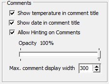
Show Temperature in comment title
Enables the display of the temperature value the comment is positioned at. The temperature (and/or date, if enabled) are shown as the first text items in the comment title, before the user-specified comment.
Show date in comment title
Enables the display of the date and time the comment is positioned at. The date (and/or temperature, if enabled) are shown as the first text items in the comment title, before the user-specified comment.
|
The temperature and/or date and time are only shown in the comment title if the corresponding option is checked to maintain the temperature and datetime. If these options are not checked for the comment, then the comment will display at an absolute pixel position, not at a specific date and time and temperature, so it makes no sense to show them. |
Allow hinting on comments
Enable this option to allow Temprecord to display "hints" on the graph when the mouse cursor is hovered above comments, or comment off-screen indicators. The hint will show:
•the comment summary (the comment summary normally displays on screen anyway but if the summary is longer than the maximum allowed on screen, or the comment itself is off-screen, the hint is a convenient way of displaying the summary line in full).
•the author and date and time the comment was created
•the editor and date and time the comment was edited (if the comment has been altered since it was created)
•the comment dat and time position (if enabled)
•the comment value position (if enabled)
Opacity
Comments are shown on the graph with variable transparency and this option allows you to adjust the opacity of the comment summary. A value of 100% renders the comment completely opaque, and the graph under it will be completely obscured. The minimum opacity is limited to 10%, so comments cannot me made completely invisible..
Max. Comment Display Width
Sets the maximum horizontal width (in screen pixels) used to display a comment
Graph Colors
Font
Use the 'Font' button to change the font Temprecord uses to display the axis annotation (the date and time on the horizontal axis and the temperature on the vertical axis). You can choose from any of the fonts installed on your computer.
Above Limits Color
Use the 'Above Limits Color' button to change the color used when displaying that part of the temperature trace that exceeds the Upper limit. If you do not want the trace to appear differently from that part of the trace that is within the limits, choose the same color as the 'In Range' color. The color you choose here is also used to display the upper limit horizontal line.`
In Range Color
Use the 'In Range Color' button to change the color used when displaying that part of the temperature trace that is between the Lower and Upper limits.
Below Limits Color
Use the 'Below Limits Color' button to change the color used when displaying those samples that are below the Lower limit. If you do not want the trace to appear differently from that part of the trace that is within the limits, choose the same color as the 'In Range' color. The color you choose here is also used to display the lower limit horizontal line.
There are separate colors defined for both temperature and humidity values.
|
If Show Limits is checked, and Show TTV Limits is not checked, the trace will display in the ‘above limit’s color when the temperature is above the upper limit, and in the ‘below limit’s color when the temperature is below the lower limit. Otherwise, the trace will display in the ‘in range’s color |
|
If Show TTV Limits is checked the trace will display in the ‘above limit’s color when the temperature is above the upper limit for the TTV period for that sample, and in the ‘below limit’s color when the temperature is below the lower limit for the TTV period of that sample. Otherwise, (if the temperature is in range for that TTV period, or the sample is prior to the first TTV period or past the last TTV period) the trace will display in the ‘in range’s color. Note that you must also have Show TTV Statistics checked for this to display. |
|
Be careful when changing these colors. If you select a color that is the same as the background of the window, any part of the trace displayed in that color will be invisible |
Axis Color
Use the 'Axis Color' button to change the color used when displaying axis annotation (the time and date, and temperature values displayed along the left-hand and bottom edge of the graph).
Graticule Color
Use the 'Graticule Color' button to change the color used when displaying the graticule lines on the graph.
Cursor Color
Use the 'Cursor Color' button to change the color used when displaying the sample cursor.
See also:
Copy to clipboard, Excel Options